Project overview
Poll Points is an intuitive survey platform that helps companies to conduct surveys with their target audience, and allow users to earn rewards while lounging on their couch.
Project goal
The goal of the project was to create an intuitive and visually appealing platform that prioritises user privacy, tailored to user preferences, and is beneficial for both companies and users.
Discover
Target users

Users are tired of generic surveys that they don't have expertise in, and worried about their privacy. They don't want to waste time answering questions that aren't relevant, and want to make sure that their information is safe. On top of that, they're getting frustrated by being disqualified from surveys halfway through, leaving them feeling like their time was wasted.
Solution
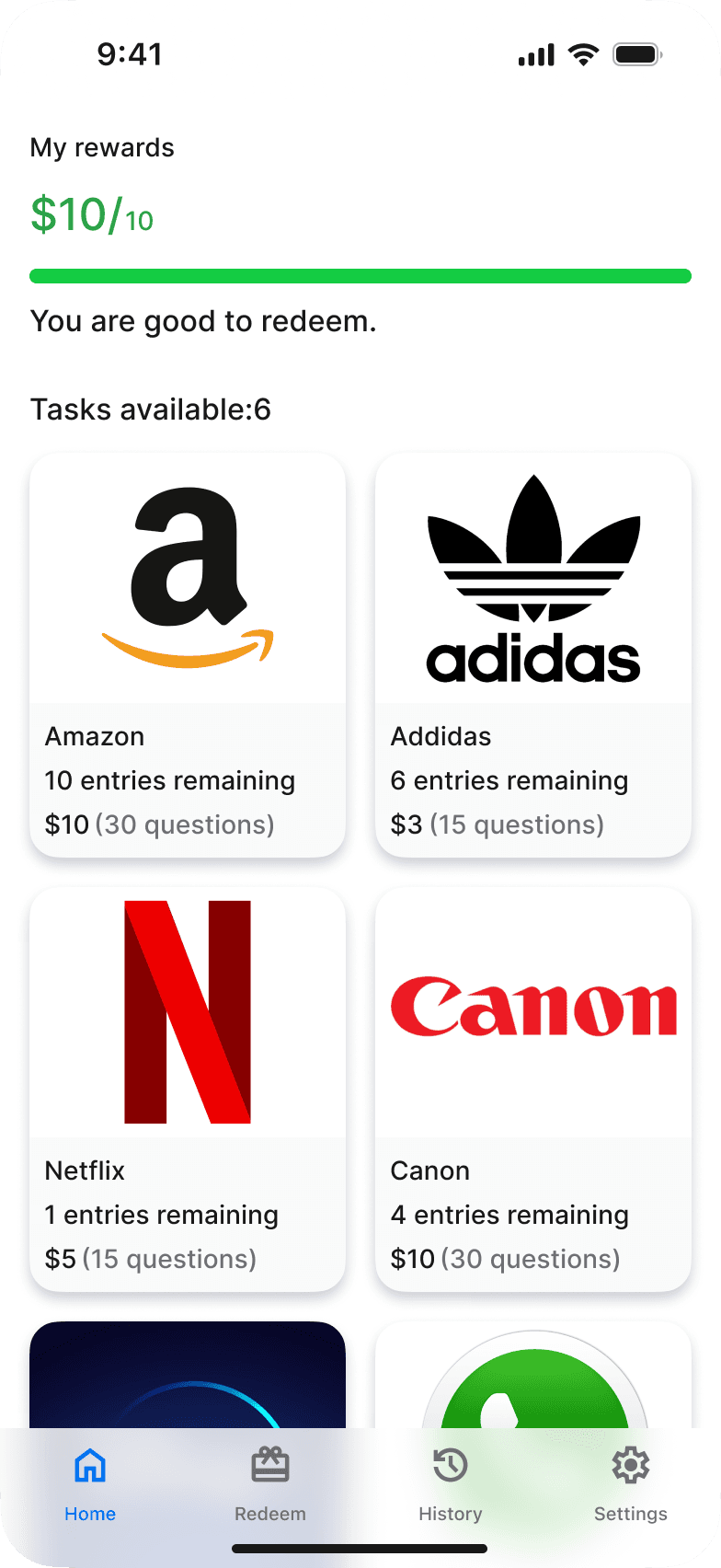
Poll Points offers personalised feed, providing surveys to users they're suited for. information and upfront requirements about survey ensure perfect matches, saving users time and frustration.
Use case
It's important to know how the product might be useful for users before starting the design

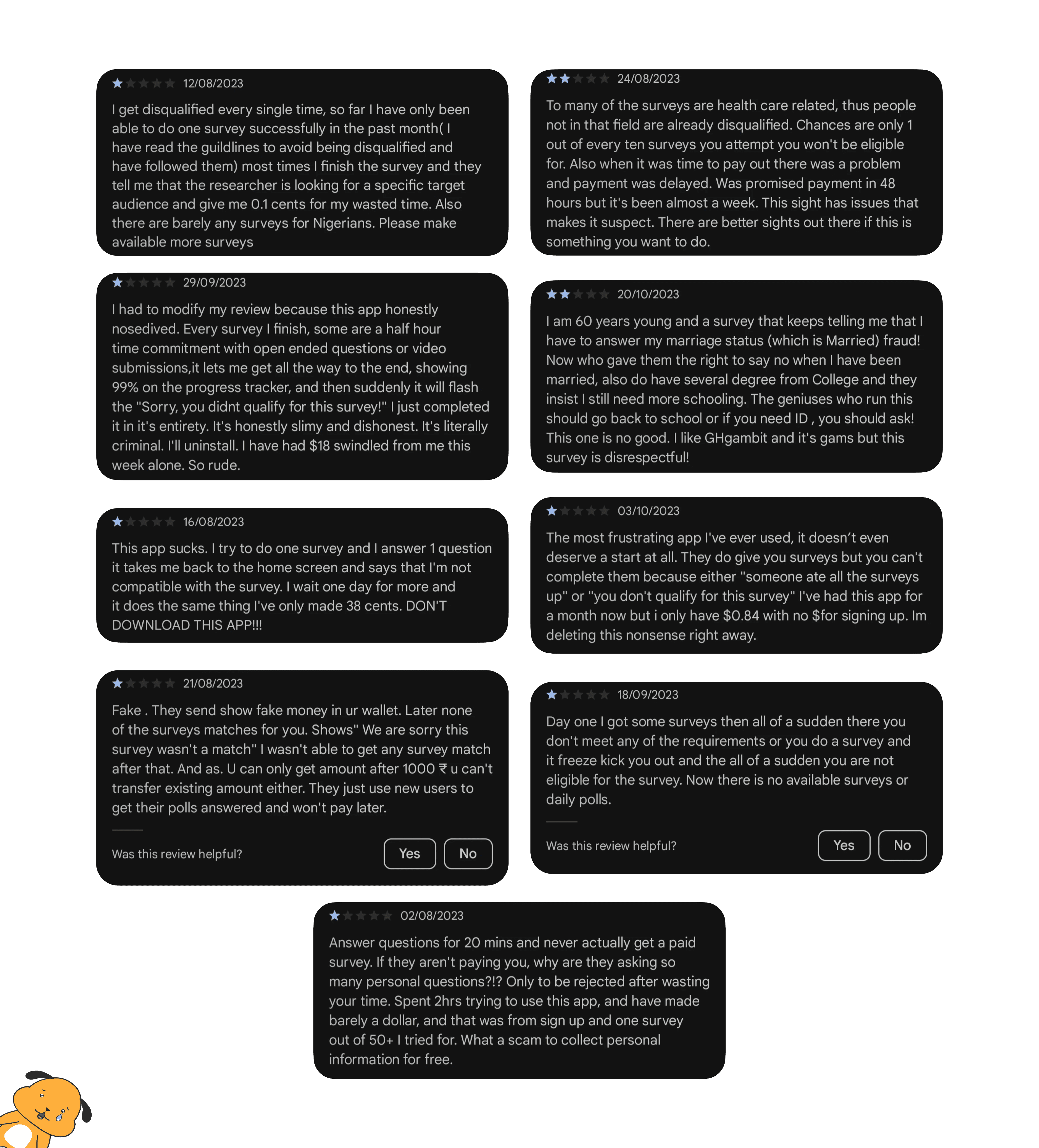
Users thoughts
I gathered some reviews of existing survey applications from internet. the message was clear users are frequently encountering disqualification or ineligibility.
Competitive anaysis
After looking into user issues, I wanted to assess existing brands and point out the exact pains users might be facing.I found many products lack privacy, personalisation, and make survey completion difficult with frequent disqualifications.

Life Points

Poll Pay

Multi Polls

Opinion rewards

Prize Rebel

Ideate
How might the product can be intuitive while respecting user privacy and avoiding disqualifications?
User insights
Considering timeline in mind, I interviewed users who could provide me unique insights.
Getting disqualified from surveys because of not meeting the survey requirements or because the survey is targeting a specific audience.
Not getting informed about how the data will gonna be used or the purpose and requirements of the survey.
Surveys are not tailored to users expertise, resulting in disqualification for many users.
Using deceptive tactics, attracting users with initial surveys but ultimately providing them nothing.
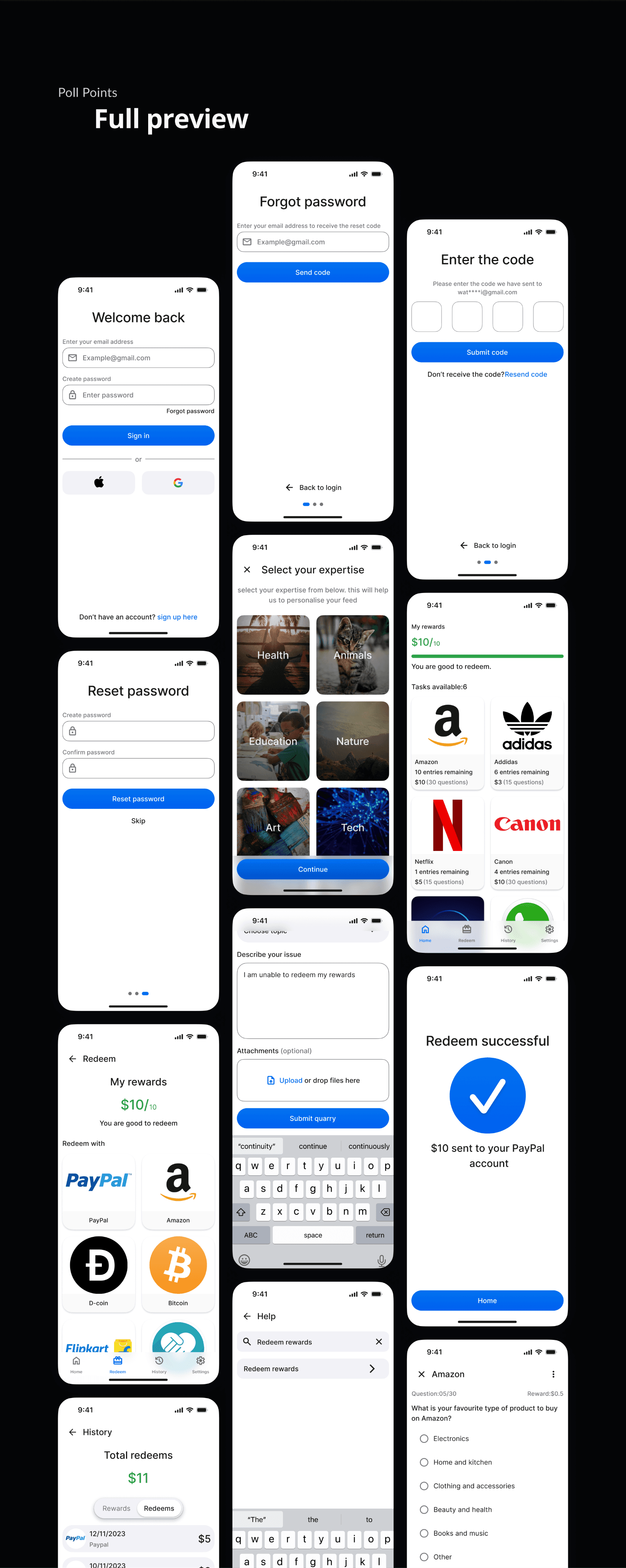
Sitemap
I created site map for Poll Points to illustrates user's journey and the actions they can perform within product.
Design priorities


Design
Exploring designs
With the goal of creating an intuitive and visually appealing design, I decided to explore a wide variety of approaches in order to land on the best option.
#Home
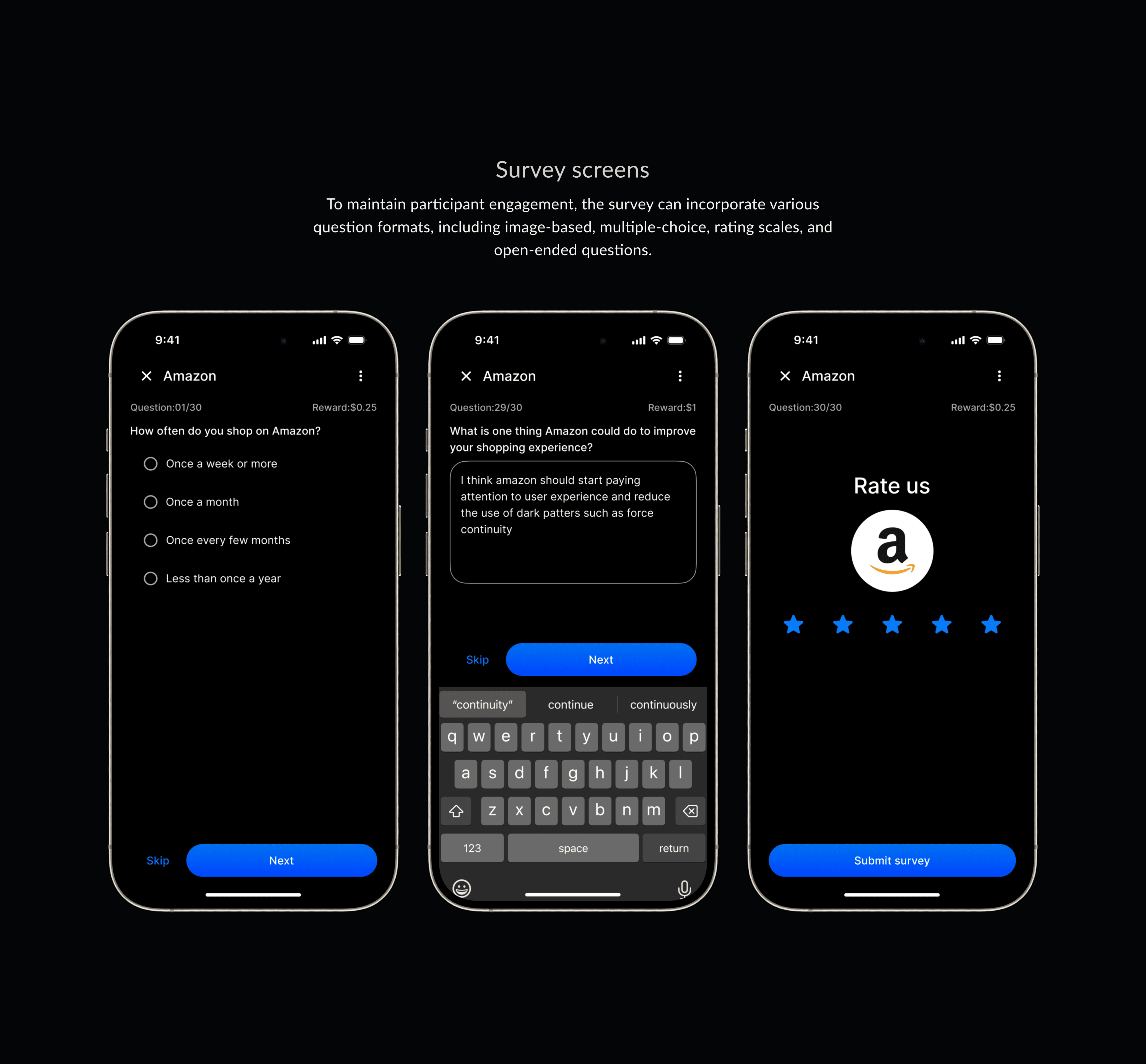
To find the optimal survey format ,I explored various survey card designs along with different reward indicators.


Version 1
Stroke cards
While the stroke cards functioned well, they lacked engagement due to being plain. Additionally, the reward indicators felt incomplete, suggesting that there should be some visuals to view progress.
Version 2
4 DP Elevated cards
Then i decided to emphasise the cards and include an animated progress indicator for rewards. However, I soon realised that the progress bar colour didn't meet accessibility standards, and the cards looked fake.
Version 3
2 DP elevated cards
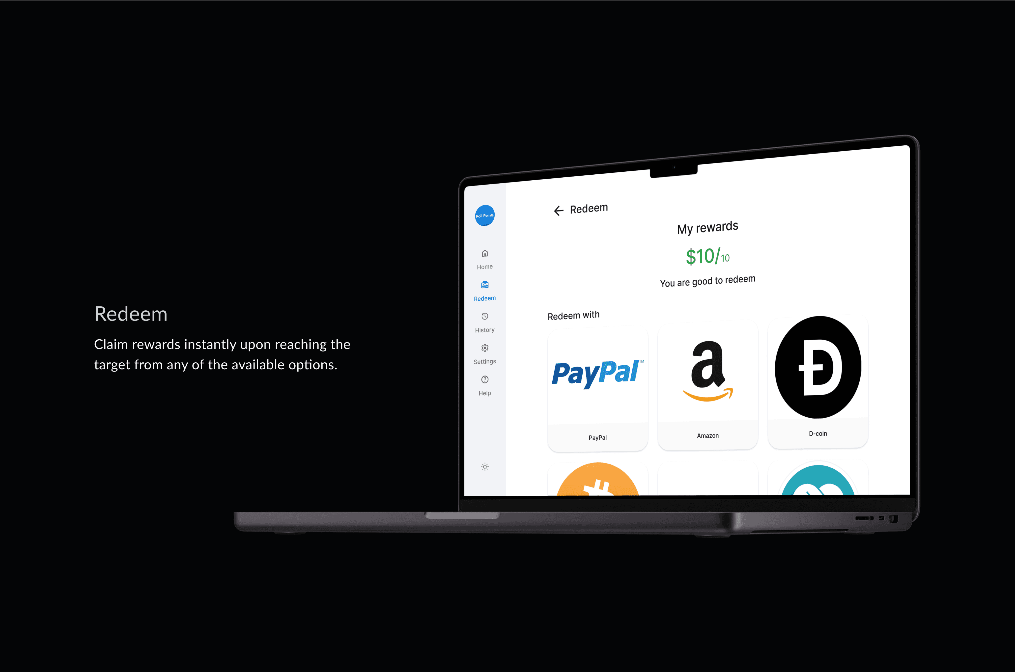
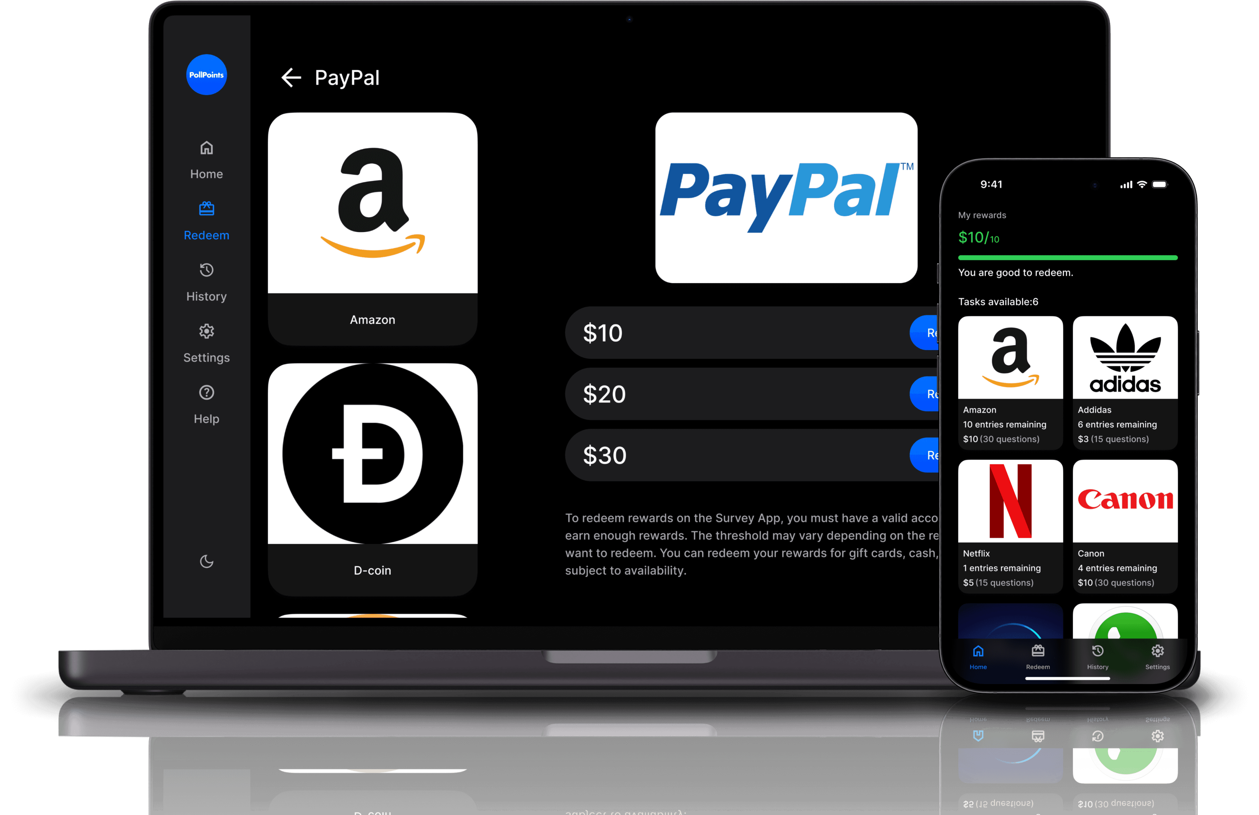
#Redeem (desktop)
Now, let's take a look at the redeem screen. The question was: how to align the cards in the correct order so that users can focus on information relevant to them.


Version 1
Single option screen
Version 2
Horizontal carousel
Version 3
Vertical carousel
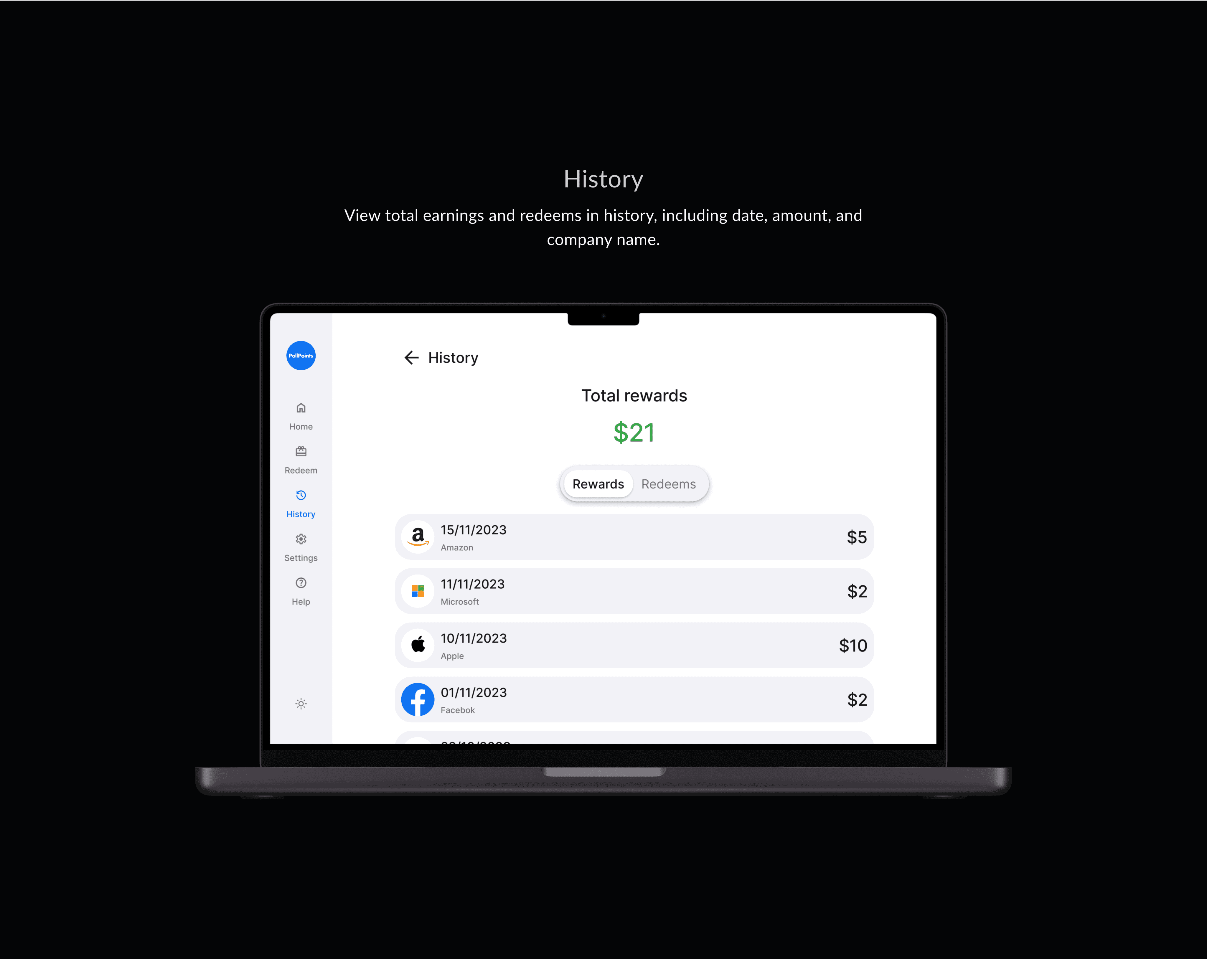
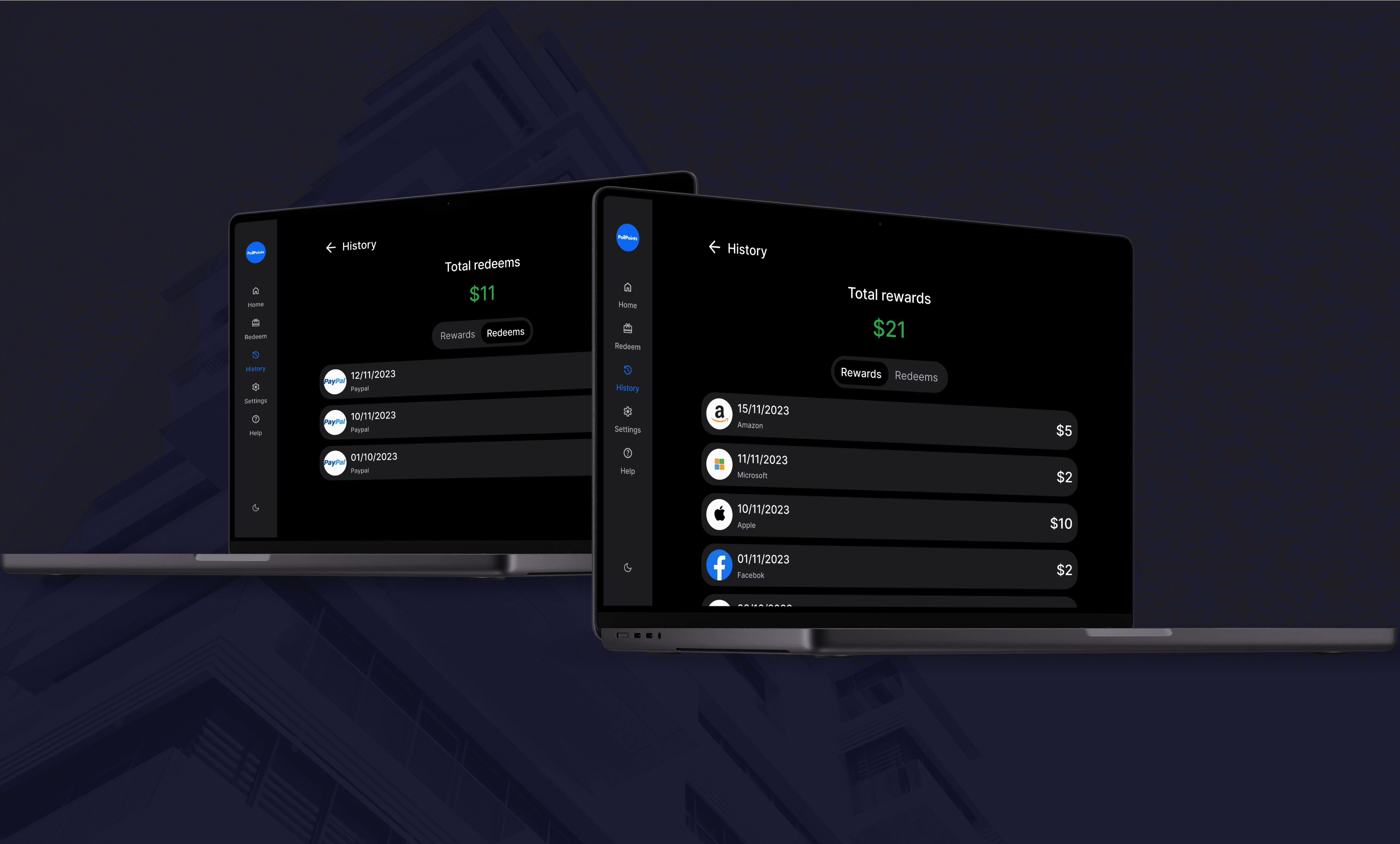
#History
Finally i wanna show you the history section. here users can see their past redeems and rewards


Version 1
No total, flat switcher
Version 2
Bottom switcher
Version 3