EPVI
Solo intern designer
About EPVI
EPVI is an electricity management startup with the goal of transforming buildings into smart and energy-conscious structures. This is achieved by monitoring real-time electricity usage, tracking device health and issues, and displaying live data on their dashboard website and application. In order to achieve this EPVI utilises technologies such as IoT, AI, and ML.


So, what the problem
Due to EPVI's numerous features and data, users were struggling to find the information they needed, such as locating the right room among hundreds of available rooms. Additionally, they were unable to use the app properly due to improper navigation and a lack of consistency between the app and the dashboard website.
Solutions
After understanding the pain points, the solutions I came up with are to enhance navigation, remove or deprioritize unnecessary elements, prioritise important features and elements, establish a design system to ensure consistency between the website and application, and simplify the understanding of functions. Huh! Easier said than done.
Now the question is
Simplicity is necessity! And when you have a platform with this level of functionality, it becomes even more important to inform users about the available features in a simplified manner.
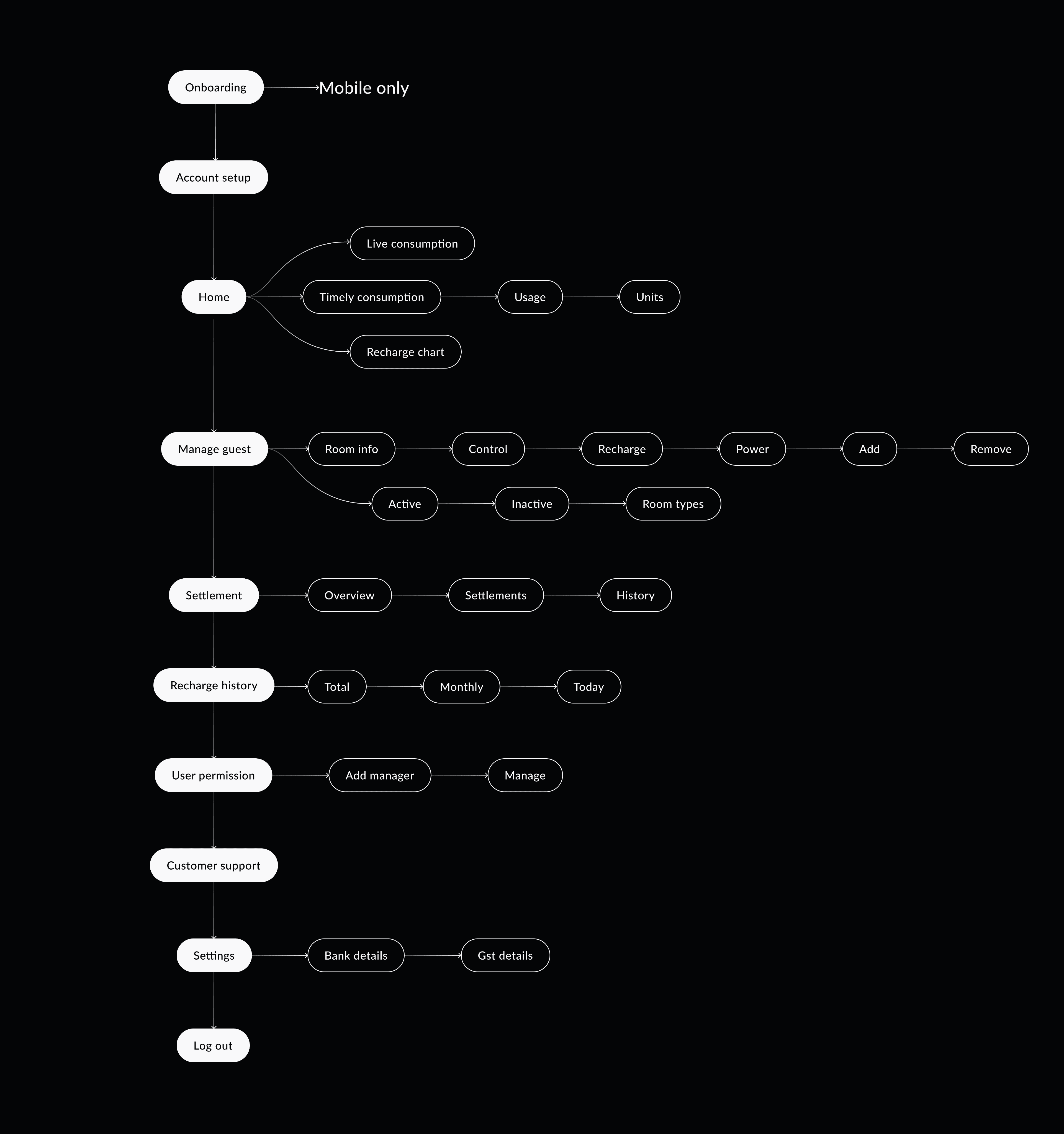
Design priorities


Exploring designs
Keeping the above questions in mind, the next phase focused on exploring a wide variety of new approaches to creating an effective command system product experience. I generated ideas in 3 "buckets" that lay the foundation of the commands primitive, and evaluated each bucket on a set of metrics that each address the three product principles above, in order to land on the best option.
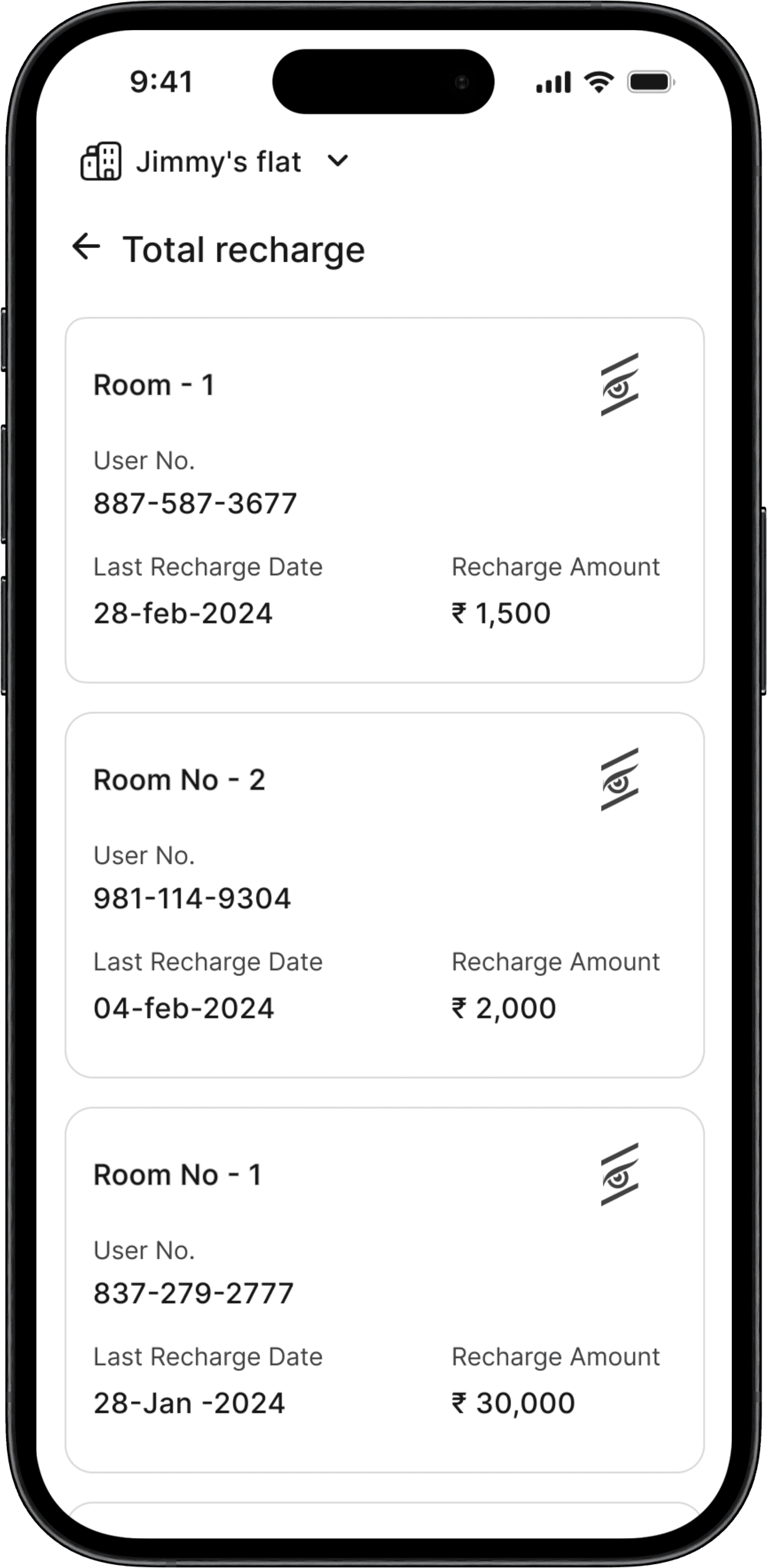
#Payments
Let's start with payment! cause that's what it's all about

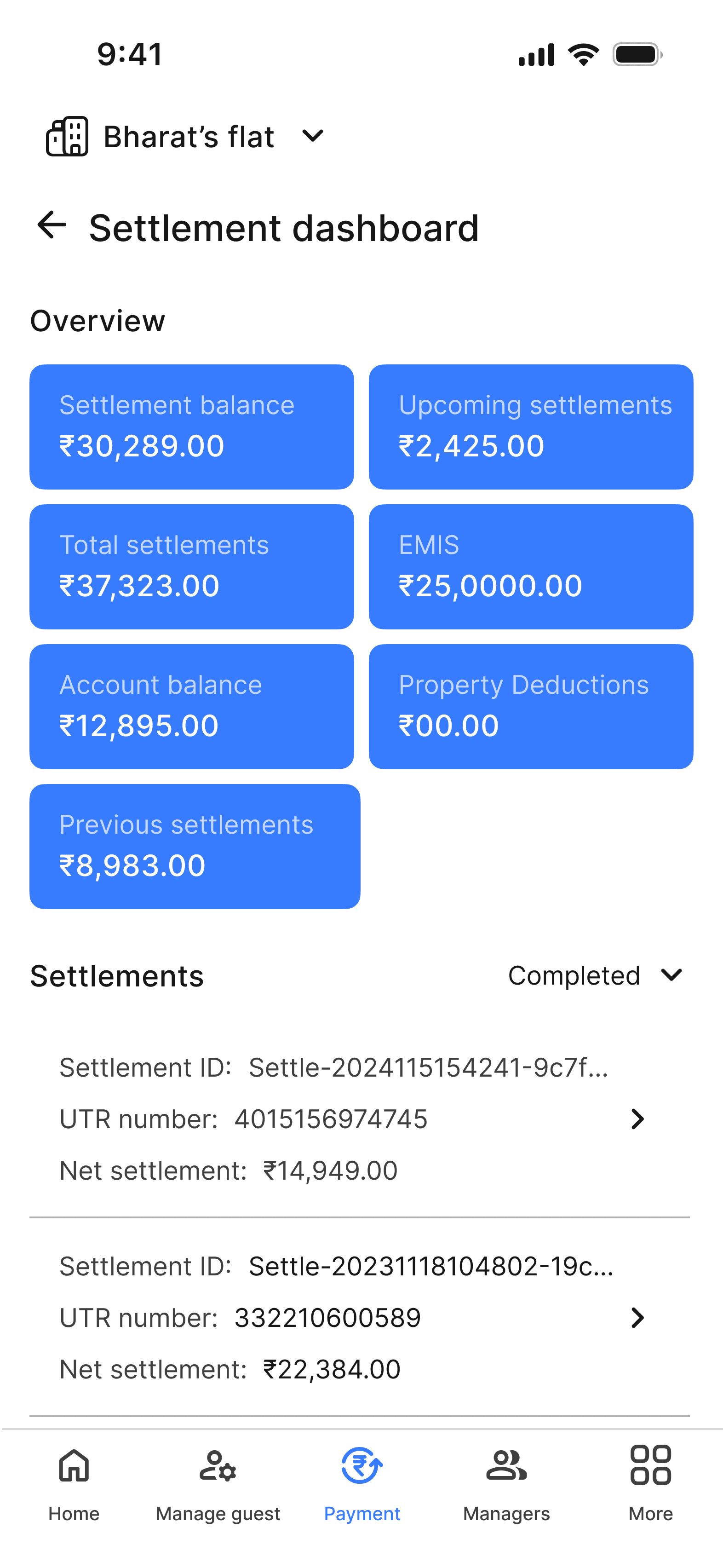

Original
The main issue was accessing the primary function, which is settlements. Users had to go through recharge history, which isn't the primary function. Also, there were problems with UI elements like checkboxes, typography, and colours.
Version 2
This version provides hierarchy, proper spacing, colors, and UI enhancements. However, it still doesn't allow users to access settlements quickly.
Version 3
The final version prioritizes settlement by placing it on the main page. Additionally, it reduces clutter by chunking elements.
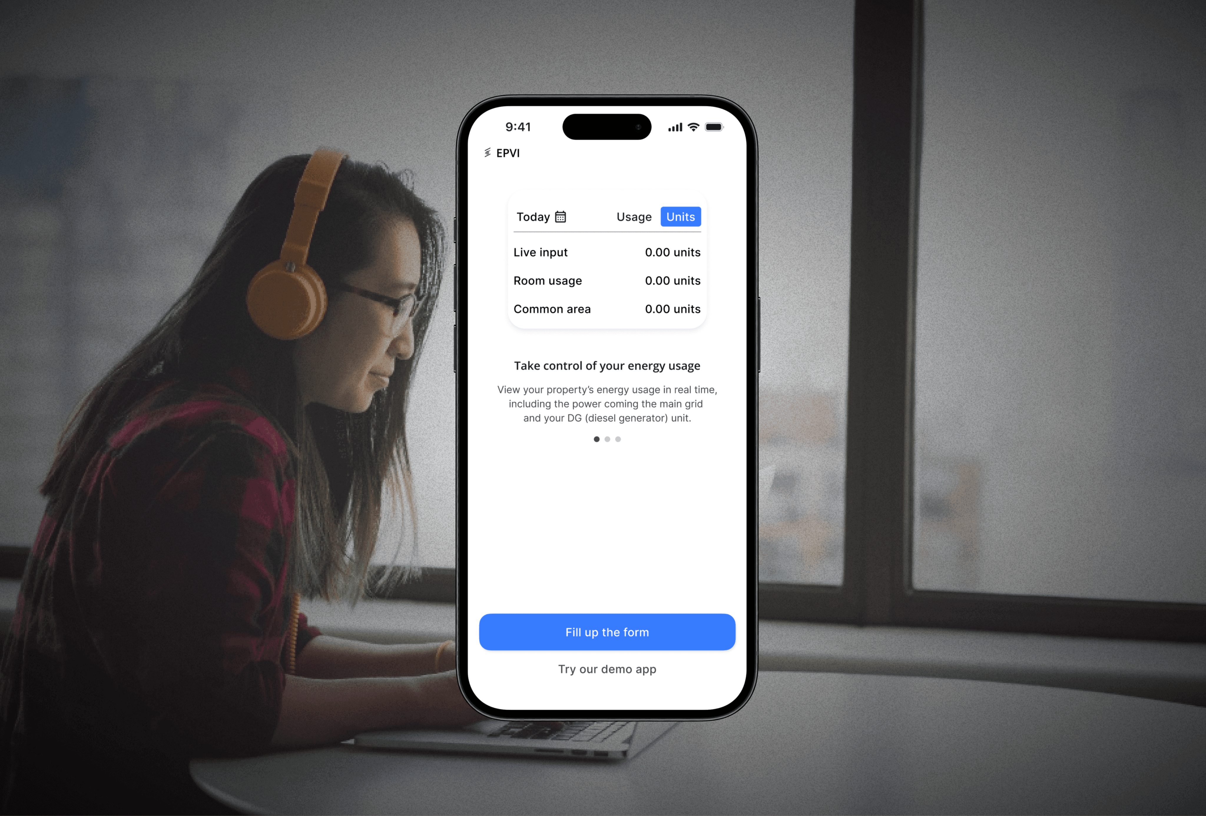
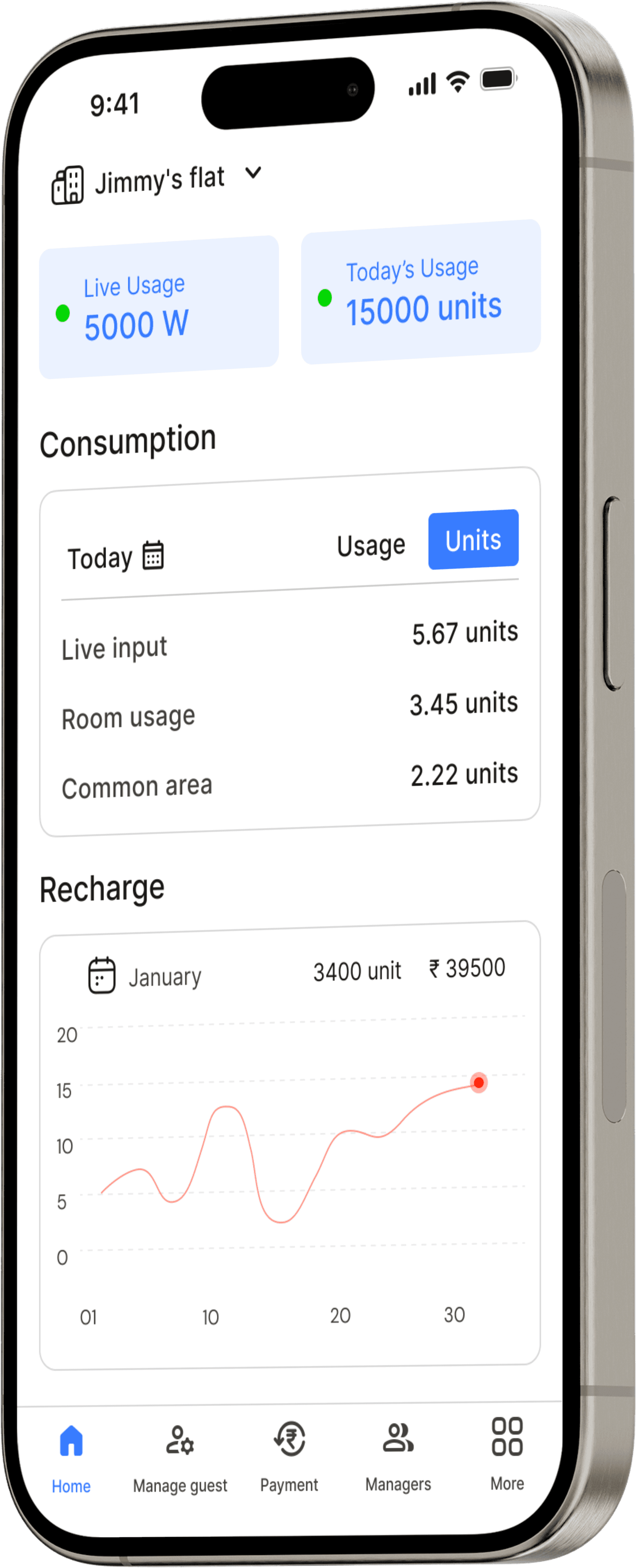
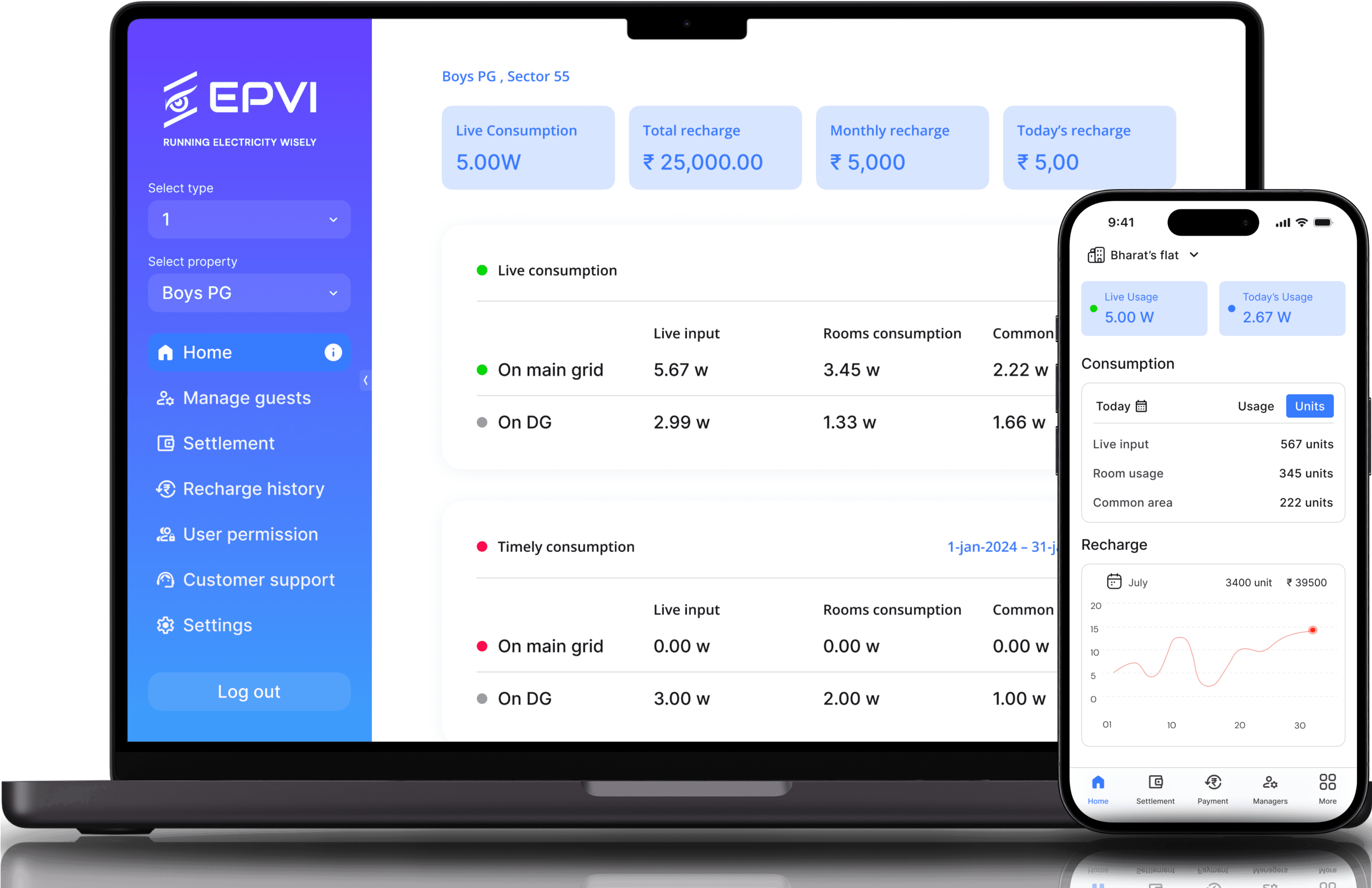
#Home (desktop)
Now! let's about about home itself, that provides the overview of energy consumption
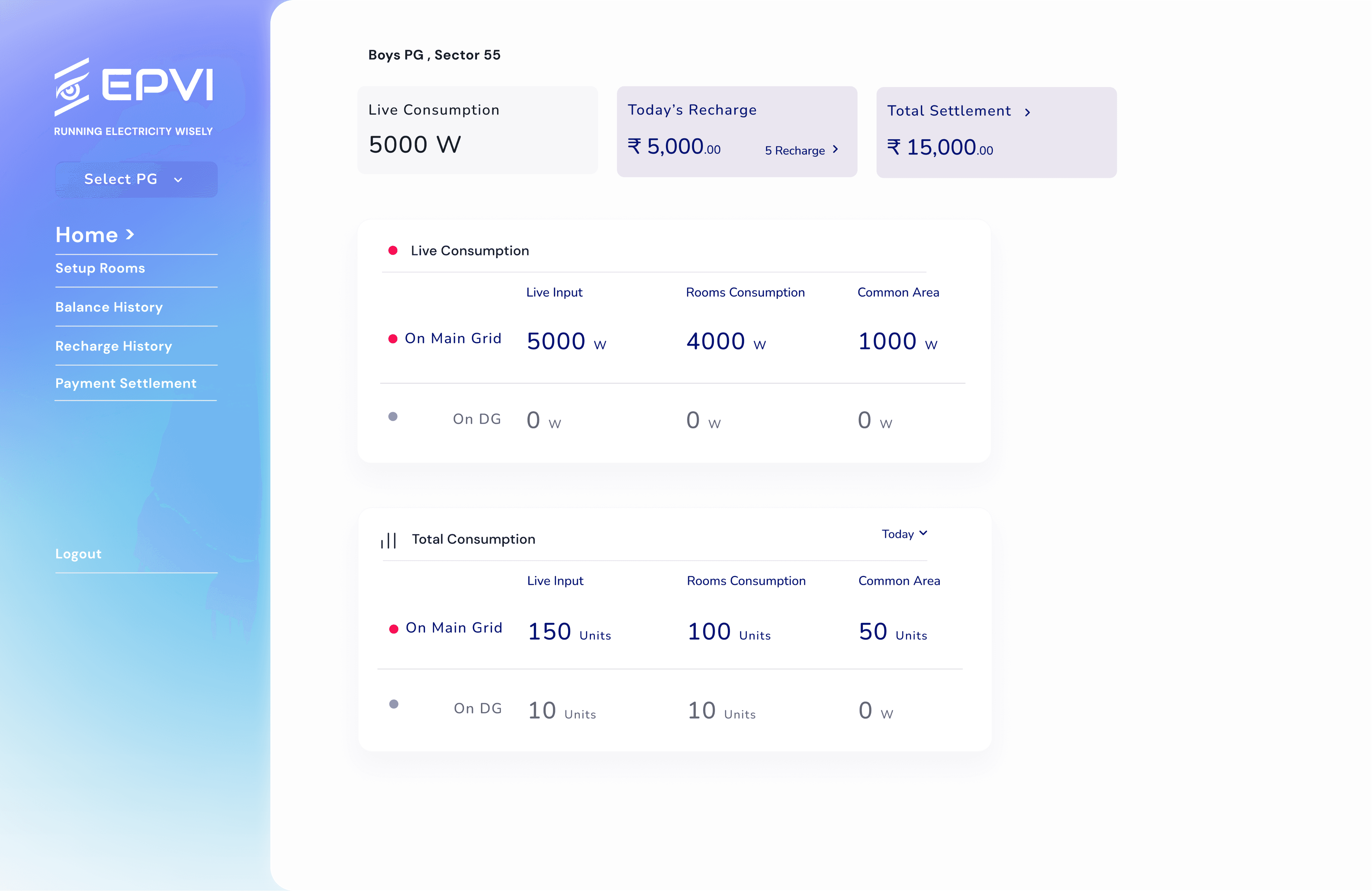
Original
Besides addressing obvious and basic issues such as hierarchy, alignment, and mobile compatibility, the design lacks visual appeal, and the navigation requires a complete overhaul.
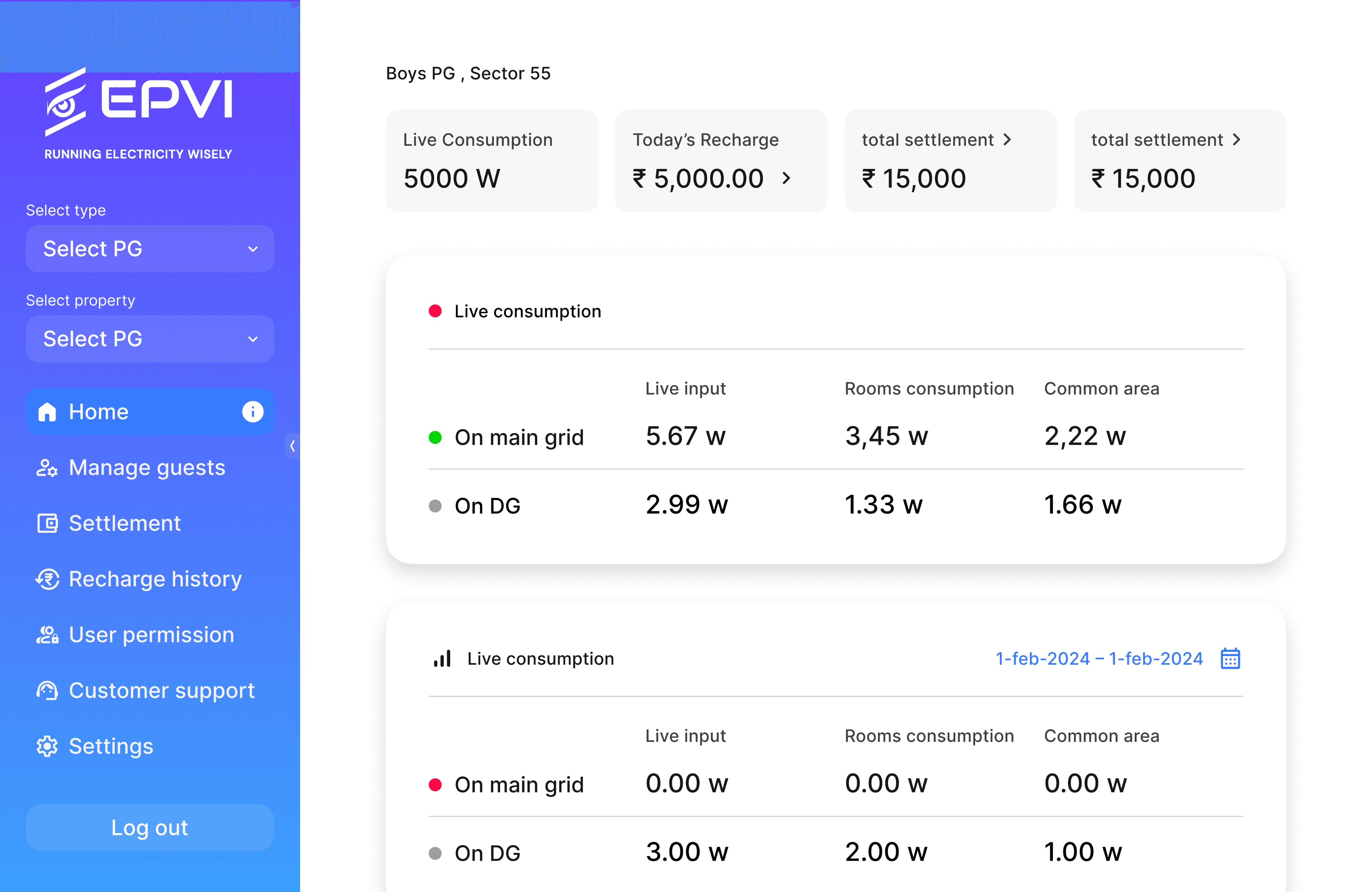
Version 2
V-2 offers a clear and intuitive navigation system that can expand and shrink to provide ample space, along with new visual cues. Additionally, the pages maintain consistent spacing and alignment.
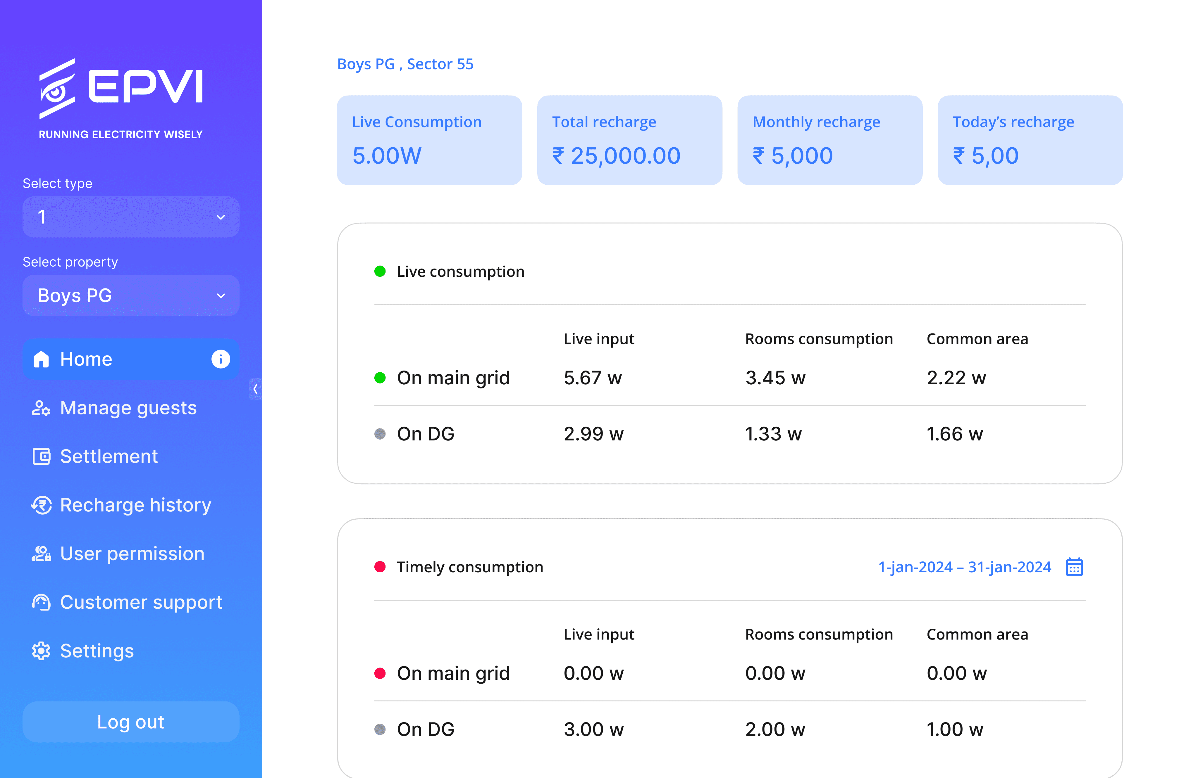
Version 3
The final version adopts the company's brand identity and utilizes flat design, incorporating strokes instead of elevations. Additionally, the dashboard maintains consistent indicators and highlights clickable elements.
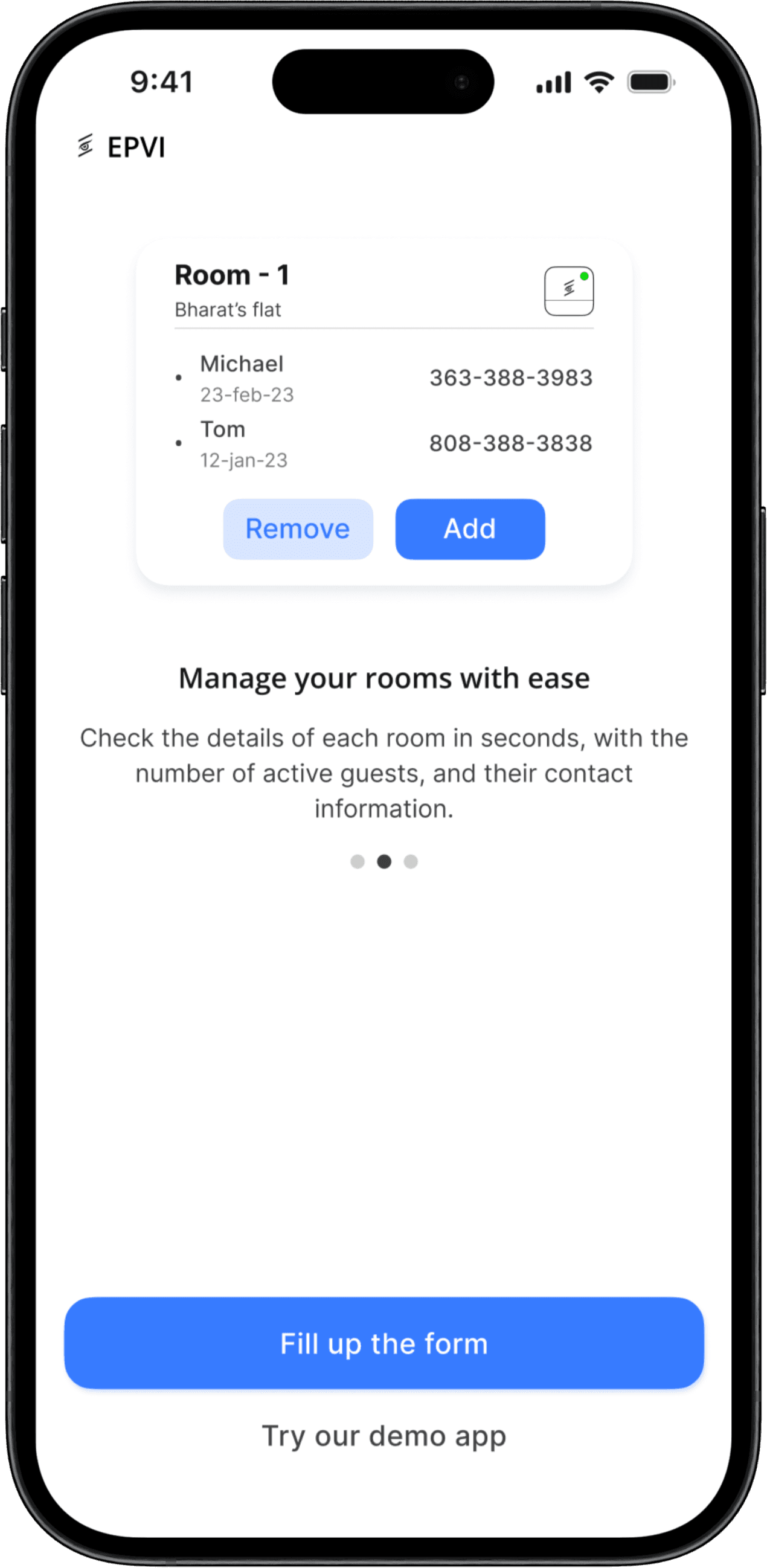
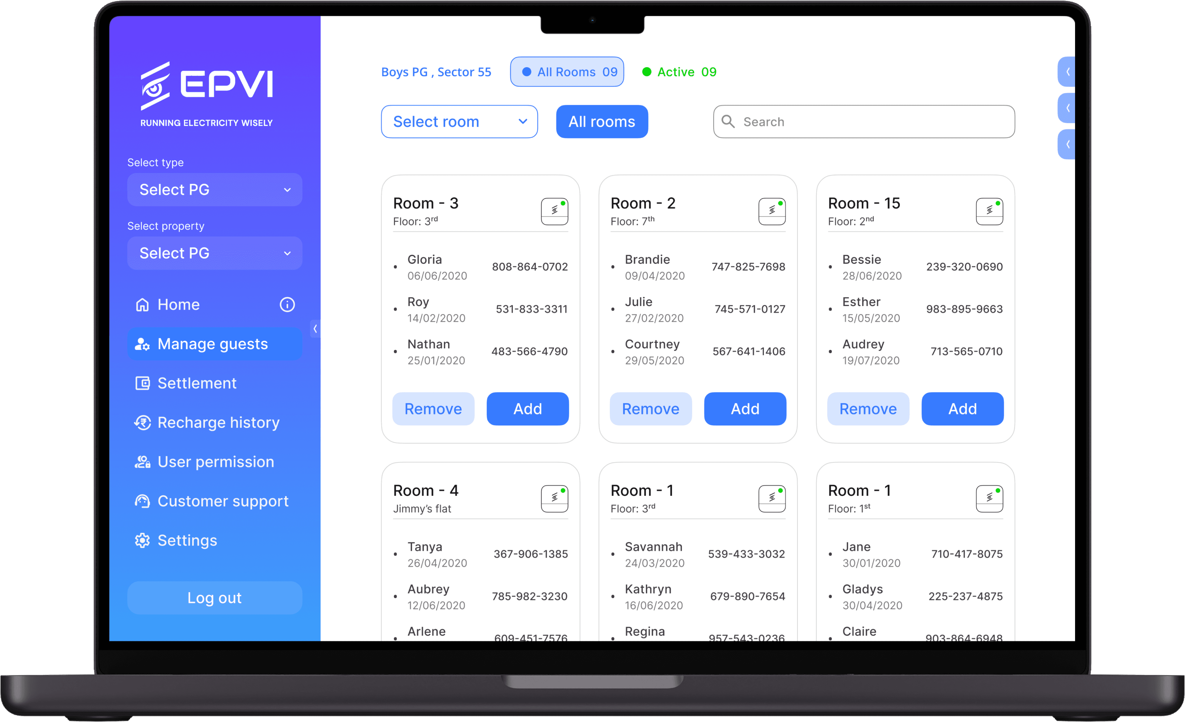
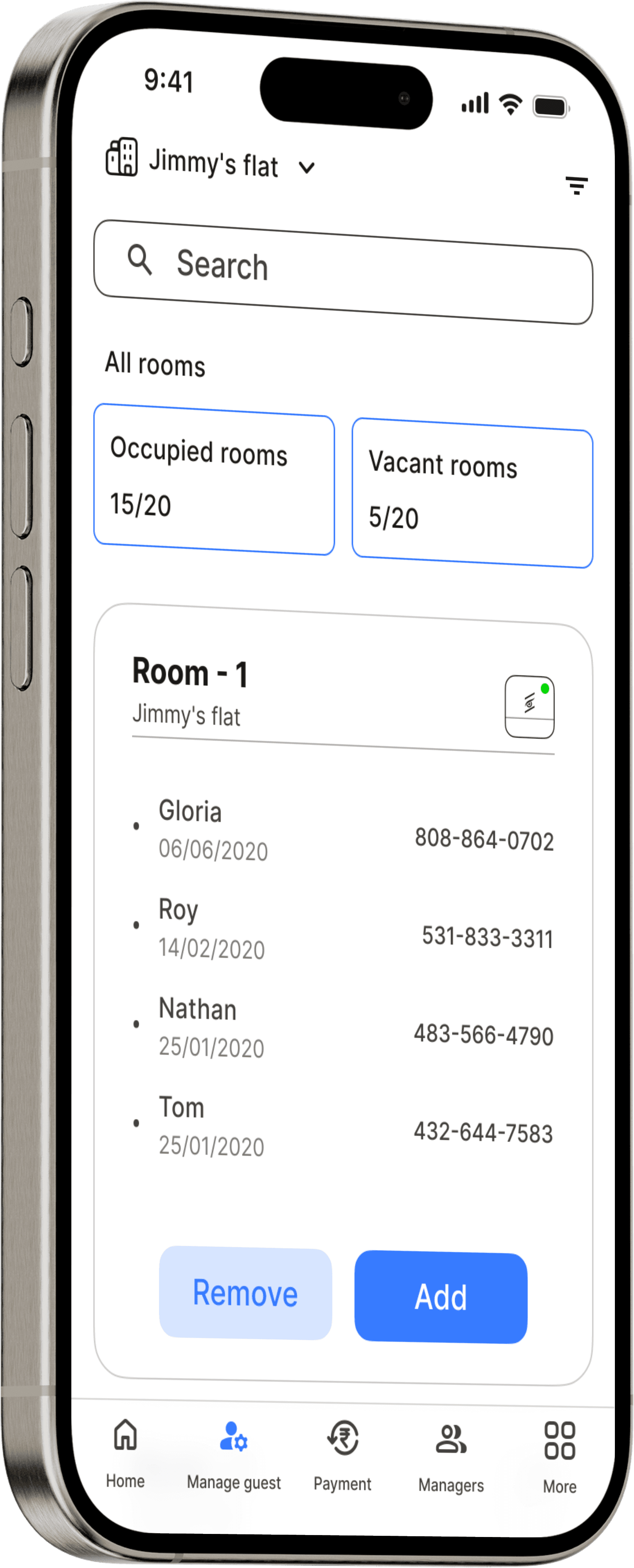
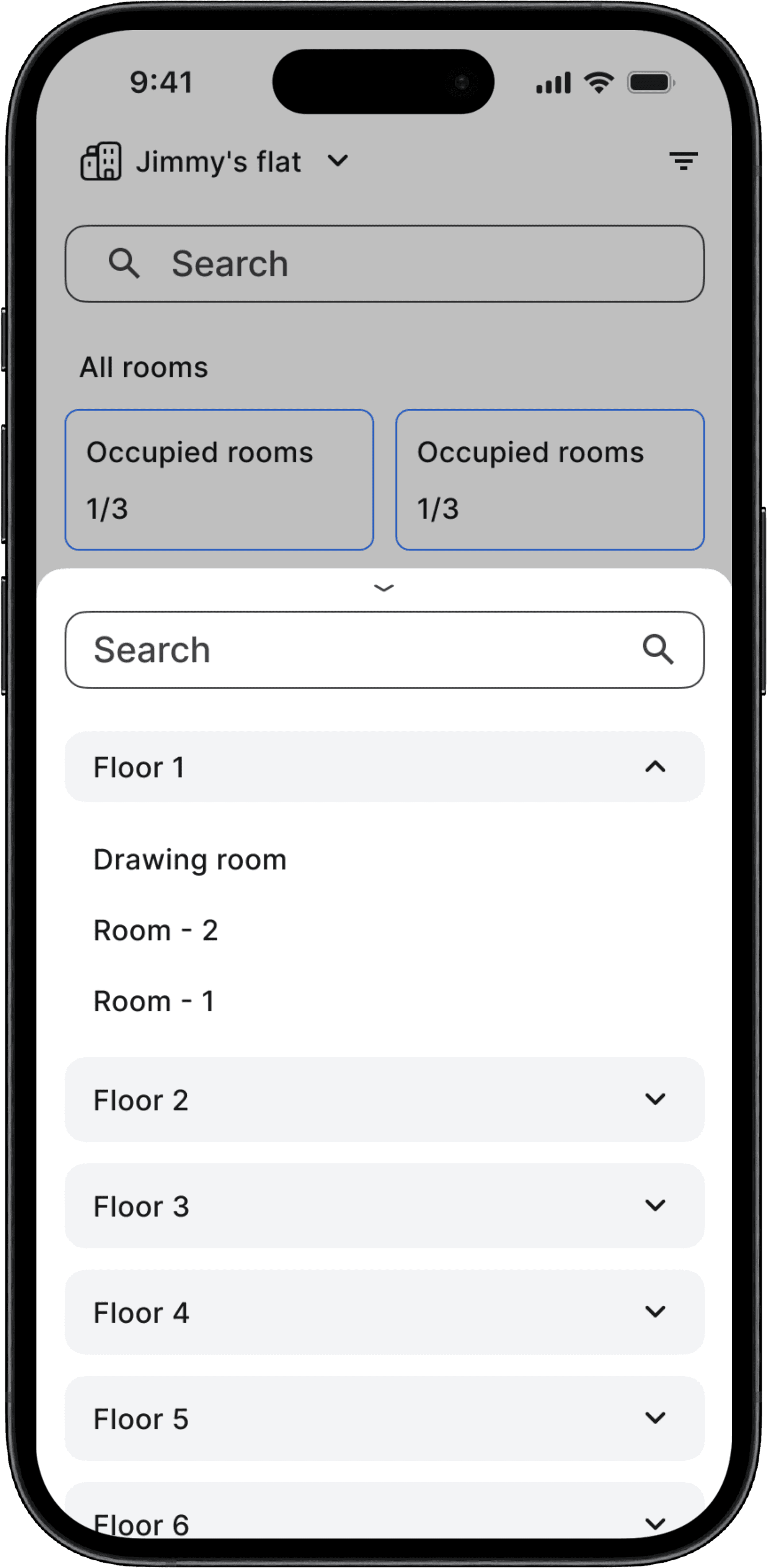
#Manage guests
Now let's talk about one that not only the one that is most used, but also the one that requires the most improvements.
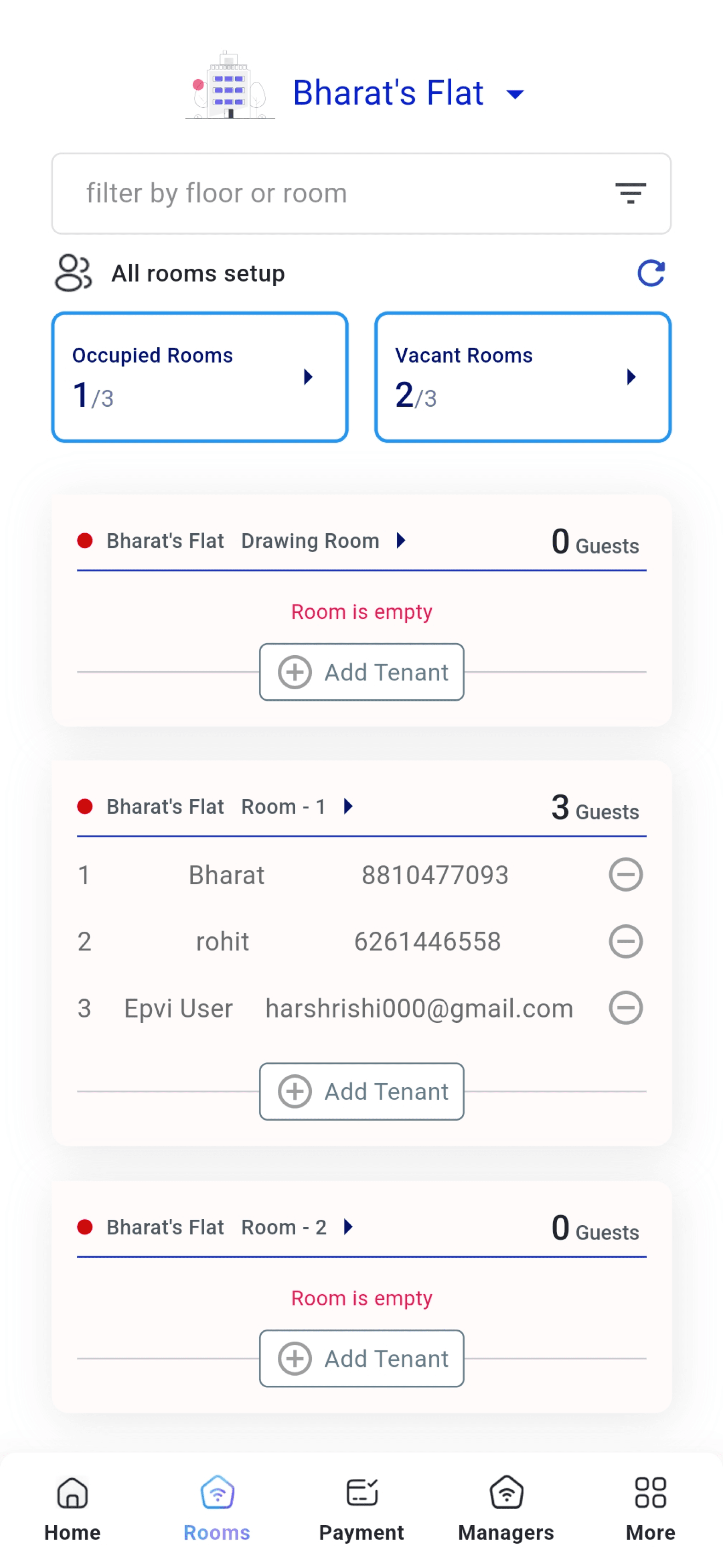

Original
The original version was difficult to follow; users believed that the filter was only accessible during searches, and the cards were poorly aligned and drastically different from the dashboards.
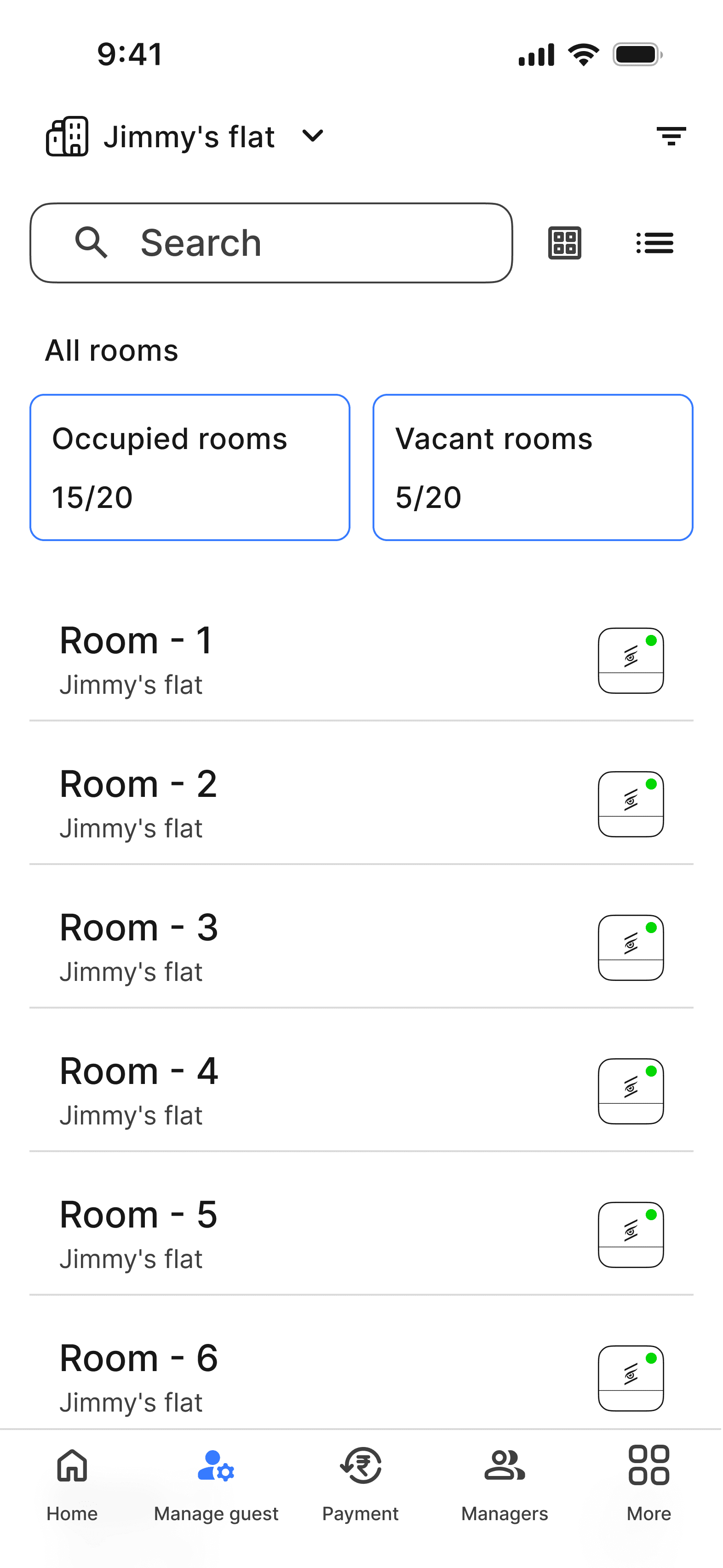
Version 2
The next version offers users easy access to filters along with a new layout, allowing users to arrange cards in both row and column formats to view multiple rooms in a single row. However, it might had created clutteredness .
Version 3
So, the final version showcases new cards with a proper, simplified and appealing layout.
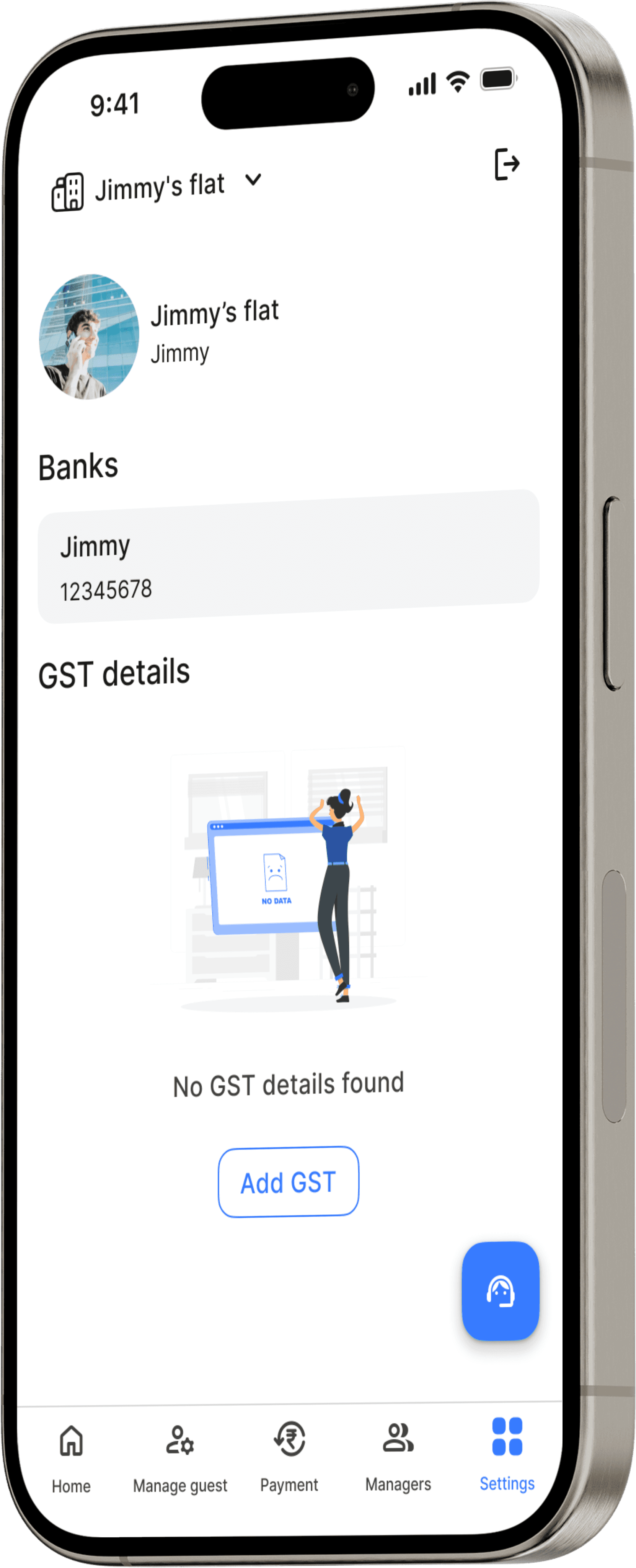
#Settings
Let's talk about the one that no one talks about

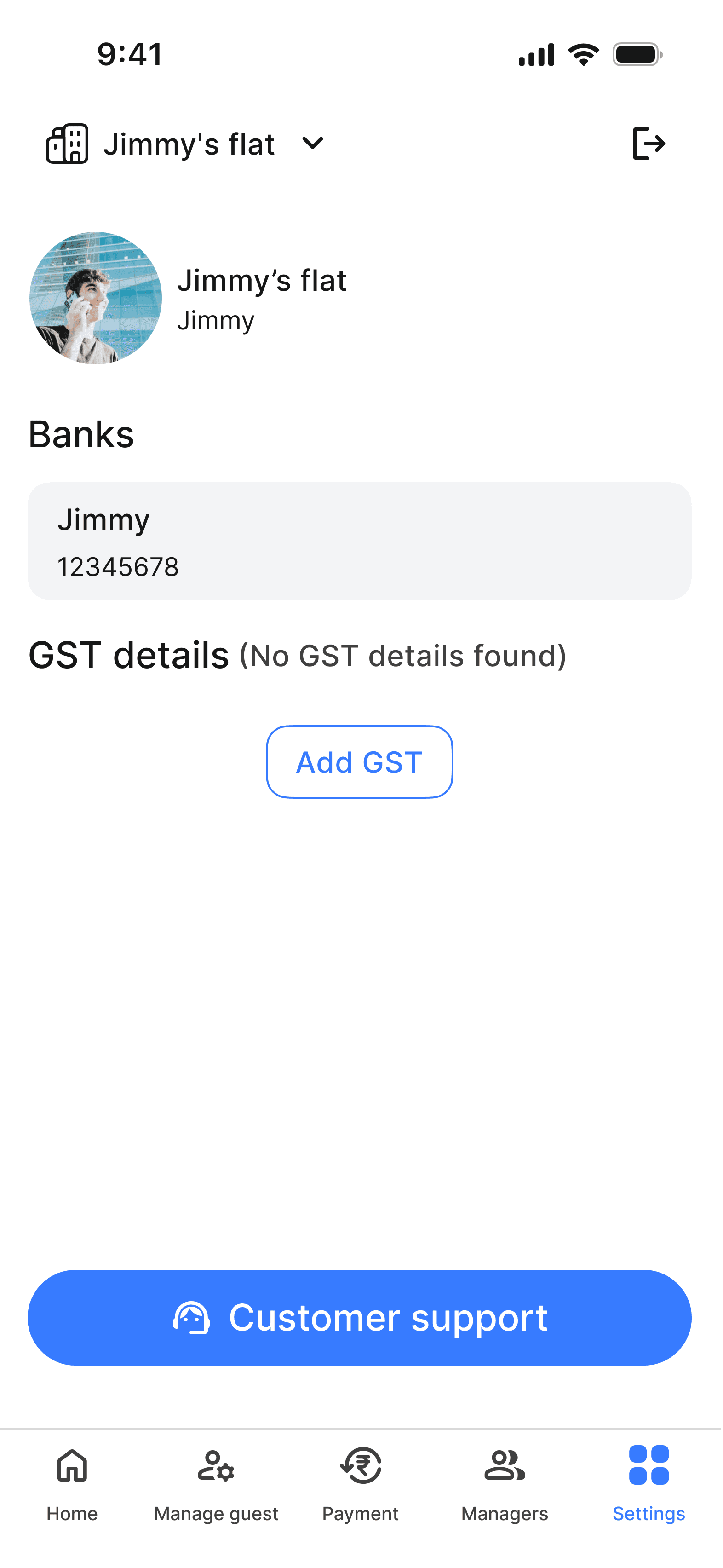
Original
The original version feels detached from the rest of the interface due to the presence of new and unnecessary elements at the top and because of design inconsistency.
Version 2
This version ensures consistency with the rest of the UI design and allows users to add profiles, although it may not be necessary
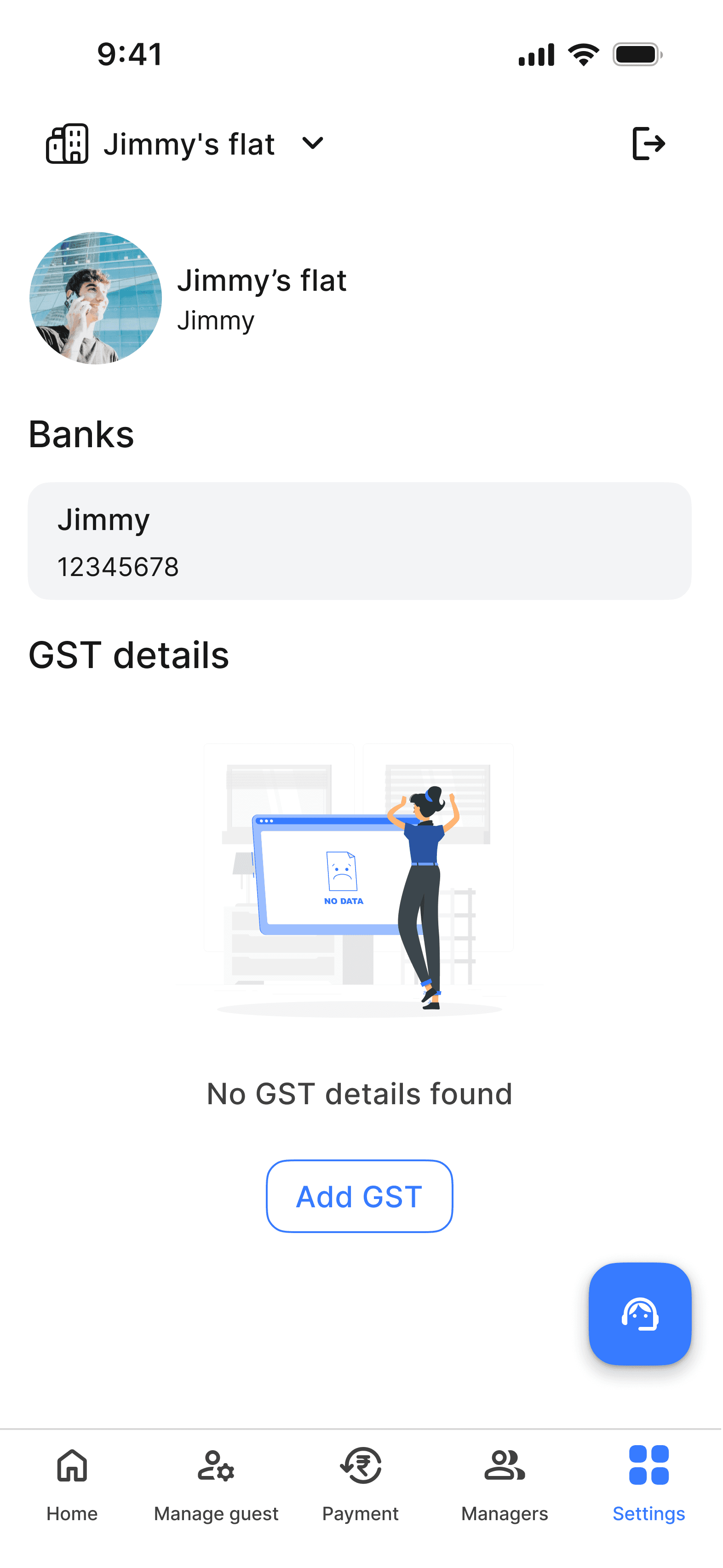
Version 3
The final version utilizes visuals to enhance the design's appeal and replaces buttons with a FAB (FAB) for support.